Warning: package 'hrbrthemes' was built under R version 4.2.3
NOTE: Either Arial Narrow or Roboto Condensed fonts are required to use these themes.
      Please use hrbrthemes::import_roboto_condensed() to install Roboto Condensed and
      if Arial Narrow is not on your system, please see https://bit.ly/arialnarrow
library(gapminder)
Warning: package 'gapminder' was built under R version 4.2.3
library(stargazer)
Please cite as:

 Hlavac, Marek (2022). stargazer: Well-Formatted Regression and Summary Statistics Tables.
 R package version 5.2.3. https://CRAN.R-project.org/package=stargazer
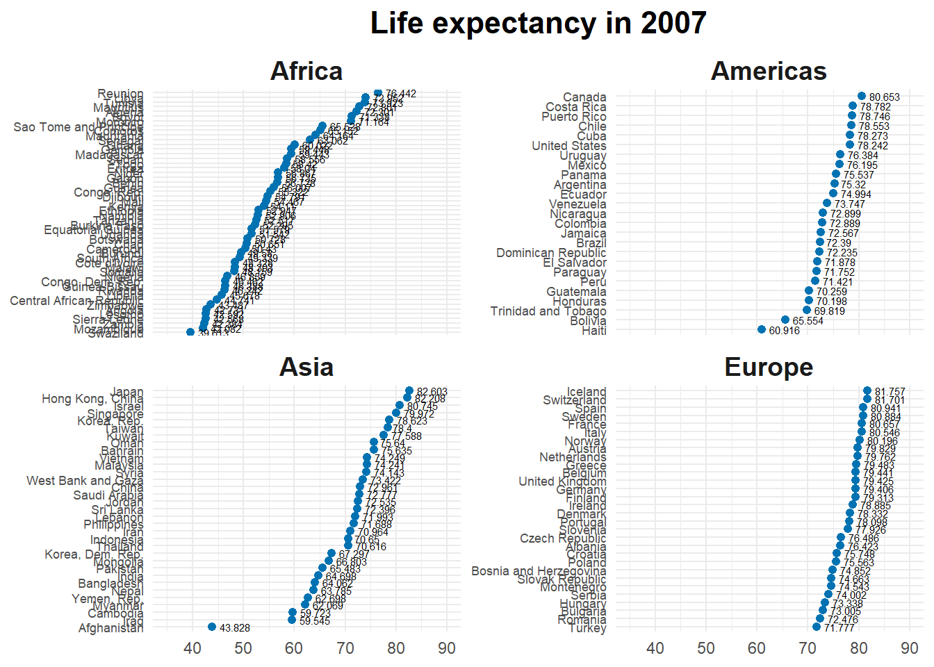
gapminder <- gapminder# Set the data and filter to include only observations from 2007 and exclude Oceaniaggplot(data =filter(gapminder, year ==2007, continent !='Oceania'),# Set the aesthetics (x-axis and y-axis) to life expectancy and reorder countries by life expectancyaes(x = lifeExp,y =fct_reorder(country, lifeExp))) +# Add a layer of points to the plot, setting the color to blue and size to 1.75geom_point(color ="#0072B2", size =1.75) +# Add a layer of text labels to the plot, setting the label to life expectancy, hjust to -.25, and size to 2geom_text(aes(label = lifeExp), hjust =-.25,size =2) +# Facet the plot by continent, with y-scales freefacet_wrap(.~continent, scales ="free_y") +# Set the x-axis label to NULL (no name) and limit the x-axis to 35-90scale_x_continuous(name =NULL,lim =c(35, 90) ) +# Set the y-axis label to NULL (no name)scale_y_discrete(name =NULL) +# Add a title to the plotlabs(title ='Life expectancy in 2007') +# Set the theme to minimaltheme_minimal() +# Customize theme elements: set the y-axis text size, the plot title size and position, and the facet strip text size and font facetheme(axis.text.y =element_text(size =rel(.75)),plot.title =element_text(size =rel(1.5),hjust =0.5,face ='bold'),strip.text =element_text(size =rel(1.25),face ='bold') )
Rows: 24 Columns: 3
── Column specification ────────────────────────────────────────────────────────
Delimiter: ","
chr (1): type
dbl (2): year, n

ℹ Use `spec()` to retrieve the full column specification for this data.
ℹ Specify the column types or set `show_col_types = FALSE` to quiet this message.
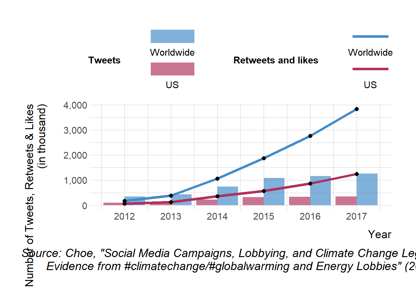
# The following line filters the rows of the n_tweets_long data frame that have a value of "n_ot_us" or "n_ot_wrld" in the "type" column. # It then creates a new column called "type" that replaces "n_ot_us" with "US" and "n_ot_wrld" with "Worldwide".n_tweets_long1 <- n_tweets_long %>%filter(type %in%c("n_ot_us", "n_ot_wrld") ) %>%mutate(type =ifelse(type =="n_ot_us", "US", "Worldwide"))# The following line filters the rows of the n_tweets_long data frame that have a value of "n_rt_lk_us" or "n_rt_lk_wrld" in the "type" column. # It then creates a new column called "type" that replaces "n_rt_lk_us" with "US" and "n_rt_lk_wrld" with "Worldwide".n_tweets_long2 <- n_tweets_long %>%filter(type %in%c("n_rt_lk_us", "n_rt_lk_wrld") ) %>%mutate(type =ifelse(type =="n_rt_lk_us", "US", "Worldwide"))p2 <-ggplot(mapping =aes(x = year, y = n)) +# Create a ggplot object with the mapping of the x-axis to the "year" variable and y-axis to the "n" variablegeom_col(n_tweets_long1, # Add a column chart layer with the "n_tweets_long1" datamapping =aes(fill = type), # Map the "type" variable to the fill aesthetic of the chartposition ='dodge', alpha = .67) +# Set the position of the columns to "dodge" and the transparency to 0.67geom_line(n_tweets_long2, # Add a line chart layer with the "n_tweets_long2" datamapping =aes(color = type), # Map the "type" variable to the color aesthetic of the chartsize =1.5) +# Set the line size to 1.5geom_point(data = n_tweets_long2, # Add a point chart layer with the "n_tweets_long2" datasize =2, # Set the point size to 2color ='black') +# Set the point color to blackscale_x_continuous(breaks =seq(2012, 2017, 1)) +# Set the x-axis breaks to the sequence from 2012 to 2017 with an interval of 1scale_y_continuous(label = scales::comma) +# Format the y-axis labels using the comma function from the scales packagescale_color_manual(values =c('maroon', '#428bca')) +# Manually set the color values for the color aestheticscale_fill_manual(values =c('maroon', '#428bca')) +# Manually set the color values for the fill aestheticguides(fill =guide_legend(reverse =TRUE, # Customize the fill legend guide by reversing the order of the legend, positioning the labels at the bottom, and setting the number of rows to 2 and the key width to 2# title.position = "top",label.position ="bottom",keywidth =2,nrow =2,order =1),color =guide_legend(reverse =TRUE, # Customize the color legend guide by reversing the order of the legend, positioning the labels at the bottom, and setting the number of rows to 2 and the key width to 2# title.position = "top",label.position ="bottom",keywidth =2,nrow =2,order =2)) +labs(x ="Year", # Add x-axis label "Year"y ="Number of Tweets, Retweets & Likes\n (in thousand)", # Add y-axis label "Number of Tweets, Retweets & Likes (in thousand)"fill ="Tweets", # Add fill legend label "Tweets"color ="Retweets and likes", # Add color legend label "Retweets and likes"caption ='Source: Choe, "Social Media Campaigns, Lobbying, and Climate Change Legislation:\n Evidence from #climatechange/#globalwarming and Energy Lobbies" (2023)') +# Add caption with source informationtheme_ipsum() +# Use the 'theme_ipsum' theme from the 'ggthemes' packagetheme(axis.title.y =element_text(size =rel(1.5),margin =margin(t =0, r =20, b =0, l =0) # set the margin for the y axis title ),axis.title.x =element_text(size =rel(1.5),margin =margin(t =10, r =0, b =0, l =0) # set the margin for the x axis title ),axis.text.x =element_text(size =rel(1.25) # set the font size for the x axis tick labels ),axis.text.y =element_text(size =rel(1.25) # set the font size for the y axis tick labels ),legend.position ='top', # set the position of the legendlegend.title =element_text(size =rel(1),face ='bold',hjust = .5# set the font size, face and horizontal justification for the legend title ),legend.text =element_text(size =rel(1) # set the font size for the legend text ),legend.spacing.x =unit(1.25, "cm"), # set the horizontal spacing between legend itemsplot.caption =element_text(size =rel(1.25),hjust = .5# set the font size and horizontal justification for the plot caption ))
Warning: Using `size` aesthetic for lines was deprecated in ggplot2 3.4.0.
ℹ Please use `linewidth` instead.
p2
Warning in grid.Call(C_stringMetric, as.graphicsAnnot(x$label)): font family
not found in Windows font database
Warning in grid.Call(C_stringMetric, as.graphicsAnnot(x$label)): font family
not found in Windows font database
Warning in grid.Call(C_textBounds, as.graphicsAnnot(x$label), x$x, x$y, : font
family not found in Windows font database

Warning in grid.Call(C_textBounds, as.graphicsAnnot(x$label), x$x, x$y, : font
family not found in Windows font database

Warning in grid.Call(C_textBounds, as.graphicsAnnot(x$label), x$x, x$y, : font
family not found in Windows font database

Warning in grid.Call(C_textBounds, as.graphicsAnnot(x$label), x$x, x$y, : font
family not found in Windows font database

Warning in grid.Call(C_textBounds, as.graphicsAnnot(x$label), x$x, x$y, : font
family not found in Windows font database

Warning in grid.Call(C_textBounds, as.graphicsAnnot(x$label), x$x, x$y, : font
family not found in Windows font database

Warning in grid.Call(C_textBounds, as.graphicsAnnot(x$label), x$x, x$y, : font
family not found in Windows font database

Warning in grid.Call(C_textBounds, as.graphicsAnnot(x$label), x$x, x$y, : font
family not found in Windows font database

Warning in grid.Call(C_textBounds, as.graphicsAnnot(x$label), x$x, x$y, : font
family not found in Windows font database

Warning in grid.Call(C_textBounds, as.graphicsAnnot(x$label), x$x, x$y, : font
family not found in Windows font database
Warning in grid.Call.graphics(C_text, as.graphicsAnnot(x$label), x$x, x$y, :
font family not found in Windows font database

Warning in grid.Call.graphics(C_text, as.graphicsAnnot(x$label), x$x, x$y, :
font family not found in Windows font database

Warning in grid.Call.graphics(C_text, as.graphicsAnnot(x$label), x$x, x$y, :
font family not found in Windows font database
Warning in grid.Call(C_textBounds, as.graphicsAnnot(x$label), x$x, x$y, : font
family not found in Windows font database

Warning in grid.Call(C_textBounds, as.graphicsAnnot(x$label), x$x, x$y, : font
family not found in Windows font database

Warning in grid.Call(C_textBounds, as.graphicsAnnot(x$label), x$x, x$y, : font
family not found in Windows font database

Warning in grid.Call(C_textBounds, as.graphicsAnnot(x$label), x$x, x$y, : font
family not found in Windows font database

Warning in grid.Call(C_textBounds, as.graphicsAnnot(x$label), x$x, x$y, : font
family not found in Windows font database
Rows: 222328 Columns: 9
── Column specification ────────────────────────────────────────────────────────
Delimiter: ","
chr  (4): animal_name, animal_gender, breed_rc, borough
dbl  (3): animal_birth_year, zip_code, extract_year
date (2): license_issued_date, license_expired_date

ℹ Use `spec()` to retrieve the full column specification for this data.
ℹ Specify the column types or set `show_col_types = FALSE` to quiet this message.
Rows: 11175 Columns: 3
── Column specification ────────────────────────────────────────────────────────
Delimiter: ","
dbl (3): X, Y, objectid

ℹ Use `spec()` to retrieve the full column specification for this data.
ℹ Specify the column types or set `show_col_types = FALSE` to quiet this message.
Rows: 262 Columns: 11
── Column specification ────────────────────────────────────────────────────────
Delimiter: ","
chr (5): po_name, state, borough, cty_fips, x_id
dbl (6): objectid, zip_code, st_fips, bld_gpostal_code, shape_leng, shape_area

ℹ Use `spec()` to retrieve the full column specification for this data.
ℹ Specify the column types or set `show_col_types = FALSE` to quiet this message.
# Joining two data frames using a common variablenyc_zips_df <- nyc_zips_df %>%left_join(nyc_zips_coord)
Joining with `by = join_by(objectid)`
Warning in left_join(., nyc_zips_coord): Each row in `x` is expected to match at most 1 row in `y`.
ℹ Row 1 of `x` matches multiple rows.
ℹ If multiple matches are expected, set `multiple = "all"` to silence this
  warning.
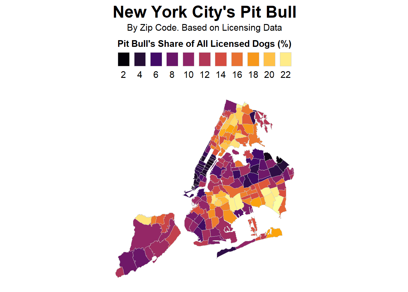
# Creating a data frame of the top 5 dog breeds by countnyc_dogs <- nyc_dog_license %>%group_by(breed_rc) %>%summarise(N =n()) %>%filter(dense_rank(-N)<=5)# Creating a data frame of dog breed frequency and percentage by zip code for the top 5 breedsnyc_fb <- nyc_dog_license %>%group_by(zip_code, breed_rc) %>%summarize(n =n()) %>%mutate(freq = n /sum(n),pct =round(freq*100, 2)) %>%filter(breed_rc %in% nyc_dogs$breed_rc )
`summarise()` has grouped output by 'zip_code'. You can override using the
`.groups` argument.
# theme_nymap <- function(base_size=9, base_family="") {# require(grid)# theme_bw(base_size=base_size, base_family=base_family) %+replace%# theme(axis.line=element_blank(),# axis.text=element_blank(),# axis.ticks=element_blank(),# axis.title=element_blank(),# panel.background=element_blank(),# panel.border=element_blank(),# panel.grid=element_blank(),# panel.spacing=unit(0, "lines"),# plot.background=element_blank(),# )# }# Create a map of New York City zip codes colored by the share of Pit Bull dogs # and their mixes out of all licensed dogs, based on licensing datafb_map <- nyc_zips_df %>%left_join(nyc_fb)
Joining with `by = join_by(zip_code)`
Warning in left_join(., nyc_fb): Each row in `x` is expected to match at most 1 row in `y`.
ℹ Row 1 of `x` matches multiple rows.
ℹ If multiple matches are expected, set `multiple = "all"` to silence this
  warning.
# Filter for Pit Bull breeds and plot the mapfilter(fb_map, breed_rc %in%c('Pit Bull (or Mix)')) %>%ggplot(mapping =aes(x = X, y = Y, fill = pct,group = zip_code)) +geom_polygon(color ="gray80", size =0.1) +# draw the zip code polygonsscale_fill_viridis_c(option ="inferno",breaks =seq(0,24,2)) +# set the color scale for Pit Bull sharelabs(fill ="Pit Bull's Share of All Licensed Dogs (%)",title ="New York City's Pit Bull",subtitle ="By Zip Code. Based on Licensing Data") +# set the map title and legend titletheme_map() +# set the map themetheme(legend.justification =c(.5,.5),legend.position ='top',legend.direction ="horizontal",legend.text =element_text(size=rel(1.25)),legend.title =element_text(size=rel(1.25),face ='bold',hjust = .5),plot.title =element_text(hjust = .5,vjust = .5,face ='bold',size =rel(2.25)),plot.subtitle =element_text(hjust = .5,vjust = .5,size =rel(1.25))) +# customize the theme of the plotcoord_map(projection ="albers", lat0 =39, lat1 =45) +# set the map projectionguides(fill =guide_legend(title.position ="top",label.position ="bottom",keywidth =1, nrow =1)) # set the legend position
Rows: 17983 Columns: 8
── Column specification ────────────────────────────────────────────────────────
Delimiter: ","
chr  (1): company
dbl  (6): Open, High, Low, Close, Adj Close, Volume
date (1): Date

ℹ Use `spec()` to retrieve the full column specification for this data.
ℹ Specify the column types or set `show_col_types = FALSE` to quiet this message.
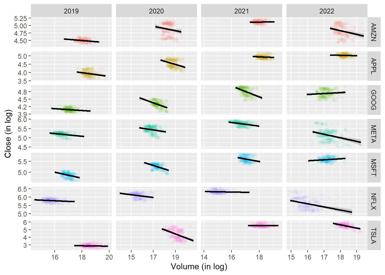
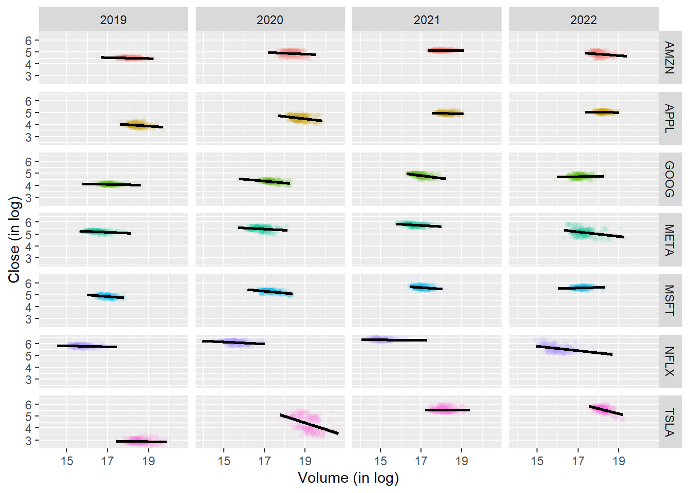
# Create a new variable year extracted from the Date columnstock <- stock %>%mutate(year =year(Date))p <-ggplot(data =filter(stock, year >=2019, year <=2022 ) , aes(x =log(Volume), y =log(Close), color = company))p +geom_point(alpha = .05) +geom_smooth(method = lm, color ='black') +facet_grid( company ~ year, scales ='free' ) +labs(x ='Volume (in log)',y ='Close (in log)') +guides(color ="none")
`geom_smooth()` using formula = 'y ~ x'
# Create a new variable year extracted from the Date columnstock <- stock %>%mutate(year =year(Date))p <-ggplot(data =filter(stock, year >=2019, year <=2022 ) , aes(x =log(Volume), y =log(Close), color = company))p +geom_point(alpha = .05) +geom_smooth(method = lm, color ='black') +facet_grid( company ~ year ) +labs(x ='Volume (in log)',y ='Close (in log)') +guides(color ="none")
`geom_smooth()` using formula = 'y ~ x'
library(broom)
Warning: package 'broom' was built under R version 4.2.3
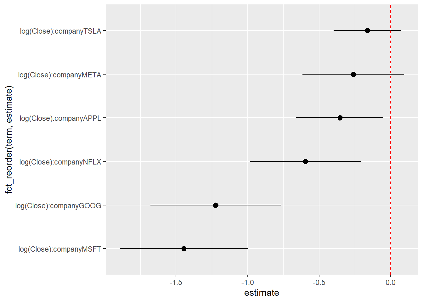
reg <-lm(log(Volume) ~log(Close) * company,data =filter(stock, year ==2020))reg_sum <-tidy(reg, conf.int = T) %>%filter(str_detect(term, "log"), term !="log(Close)")ggplot(reg_sum,aes(x = estimate, y =fct_reorder(term, estimate),xmin = conf.low, xmax = conf.high)) +geom_point() +geom_pointrange() +geom_vline(xintercept =0, color ='red', lty =2)